Emmaus Redesign
Services
Web Design
Client
Emmaus UK
The Brief
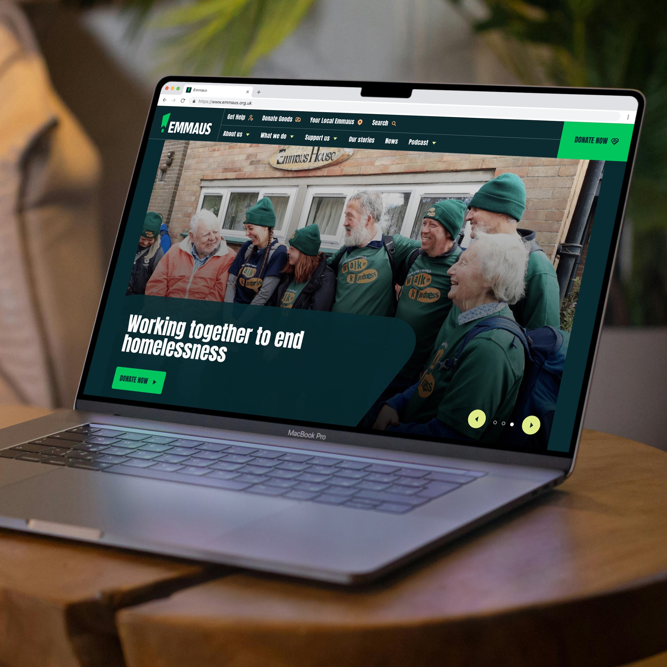
Working together to end homelessness and redesigning one of the biggest charities in the UK, Emmaus' website
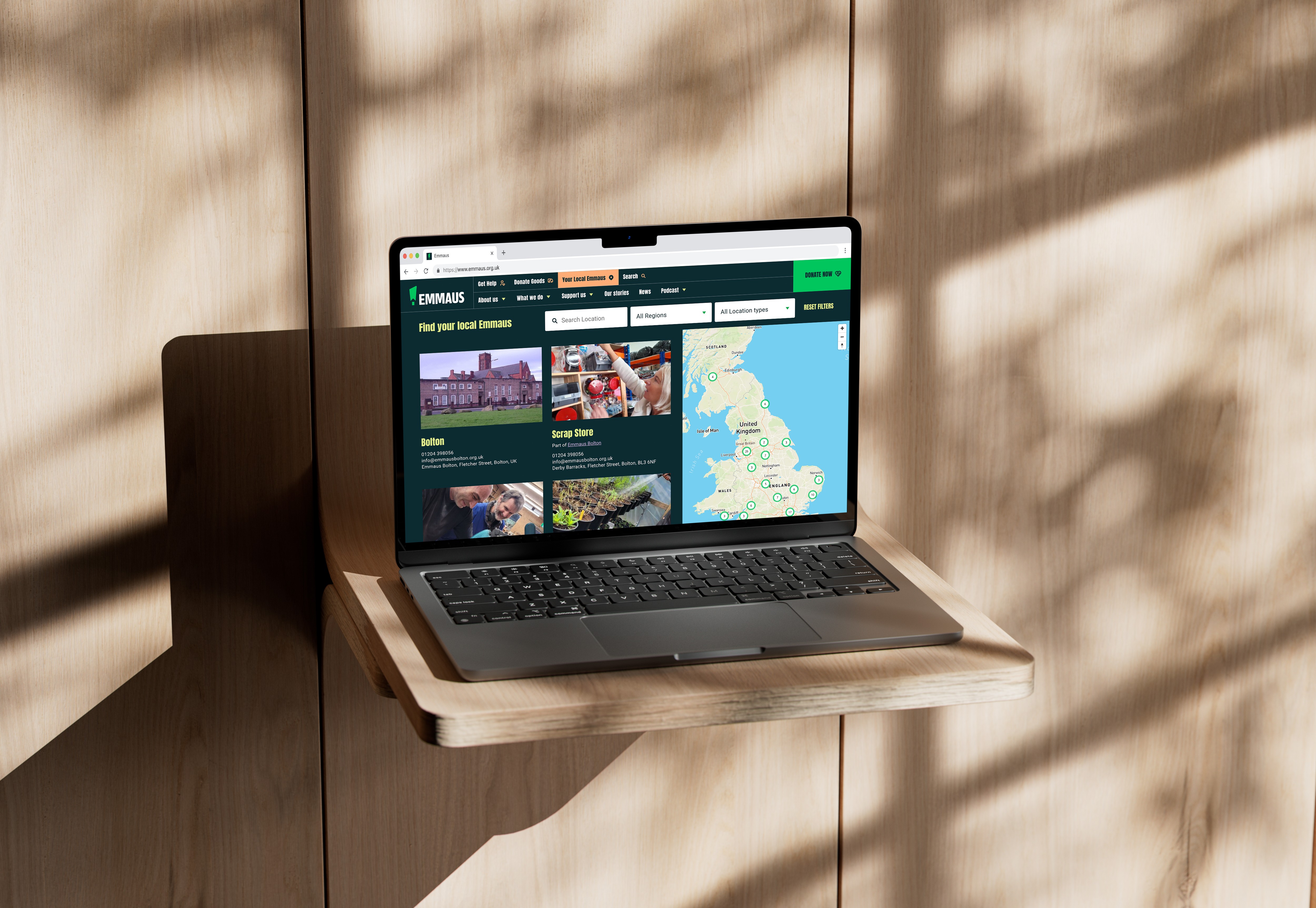
Emmaus was our longest retained partnership at Project Simply we have recently relaunched all of their sites with their beautiful new brand. Under the ethos of “Same mission. Same values. Louder voice.” We have transformed the Emmaus UK site and its community sites with their striking new visual identity. The result is a clean and accessible intuitive series of websites for them that will facilitate clear communication and interaction with all audiences and continue to drive connection and donations to end homelessness one day at a

Pushing the aeshetics while keeping on eye on the community sites was a key consideration for this project. Emmaus have over 50 community sites, already complete with content and donation forms.
When using the new Emmaus brand, the main danger was our work would affect every site in the ecosystem, ran by local communities. We ensured disruption was kept to a minimum by updating the CSS only, ensuring everyone could use the sites as normal.


Takeaways